-
Shop
- Adidas
- Advanced Technologies
- Bathroom
- Best-Sellers
- Car Accessories
- Dating & Social Skills
- Digital Resources
- AI & Technology
- AI Skills
- Beauty
- Budgeting & Saving
- Car Buying & Ownership
- Cozy Feast Collection
- Electronics & Technology
- Emotional Intelligence
- Entrepreneurship & Business Growth
- Financial Education
- Financial Independence
- Financial Mindset & Psychology
- Goal Setting
- Home Styling & Organization
- Kitchen & Recipes
- Leadership
- Mindfulness
- Mindset
- Motivation
- Online Business
- Parenting & Child Development
- Personal Style & Fashion
- Pet Lifestyle & Wellness
- Positive Thinking
- Productivity
- Self Confidence
- Sleep Improvement
- Smart Life with AI
- Stress Management & Relaxation
- Travel Planning
- Wellness
- Yoga & Fitness
- Yoga & Mind-Body Practices
- Easter Products
- Education & Learning
- Family & Parenting
- Fashion
- Alexander McQueen
- Bags
- Bags & Wallets
- Balenciaga
- Belts
- Blazers
- Bottega Veneta
- Brunello Cucinelli
- Burberry
- Chanel
- Chloé
- Dior
- Dolce & Gabbana
- Dresses
- Etro
- Fendi
- Gucci
- Hats & Hair Accessories
- Jewelry
- Jil Sander
- Keychains
- Kiton
- Luggage
- Miu Miu
- Off-White
- Outerwear
- Prada
- Rick Owens
- Saint Laurent
- Shoes
- Socks & Tights
- The Row
- Tom Ford
- Valentino
- Valentino Garavani
- Versace
- Vivienne Westwood
- Watches
- Furniture
- Gadgets
- Health & Beauty
- Health & Wellness
- Home & Garden
- Home Electronics
- Kids & Babies
- Kitchen
- Lighting
- Patio, Lawn & Garden
- Personal Growth
- Pet Care
- Pet Supplies
- Pets
- Smart Home Living Guides
- Sport & Outdoors
- Stress Relief & Relaxation
- TikTok Growth & Monetization Mastery
- Travel
- Wealth
- Wealth Building
- Popular
- Best deals
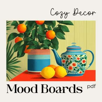
AI Cozy Table Mood Boards: Warm Tablescapes Checklist
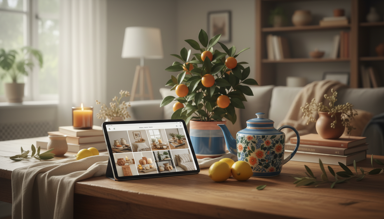
Cozy Table Decor Mood Boards: A Checklist-Driven Way to Use AI for Warm, Inviting Tablescapes
Cozy styling comes together faster when the vibe is clear before a single item is purchased or placed. A mood board helps lock in color, texture, lighting, and small details that make a tablescape feel warm and lived-in. Using AI can speed up the visual exploration, while a checklist keeps the results grounded in real materials, proportions, and budget. For more guidance, see This AI Tool Can Transform Your Ideas Into Digital Mood Boards.
What makes a tablescape feel cozy
- Warmth: Amber lighting, creamy whites, warm neutrals, and soft contrast instead of stark black-and-white.
- Texture layering: Linen, wool, wood grain, stoneware, matte metals, and natural fibers to avoid a flat look.
- Human scale: Low centerpieces, reachable serving pieces, and comfortable spacing so the table feels welcoming, not staged.
- Seasonal cues: Subtle nods (citrus, branches, dried florals, spices) rather than literal holiday décor.
Gather inputs before generating images
A few practical decisions up front make AI visuals far more useful—and easier to recreate with items you can actually buy.
- Define the occasion and setting: everyday dinner, brunch, holiday hosting, romantic night in, or small gathering.
- Pick a mood direction: rustic, modern cozy, Scandinavian, vintage cottage, or candlelit minimal.
- Set practical constraints: table size/shape, number of place settings, kid/pet safety, storage limits, and cleanup tolerance.
- Collect “anchor items” already owned: dinnerware, table, chairs, centerpiece vessel, table runner, or candlesticks.
- Decide the non-negotiables: must-use color, a family heirloom piece, a theme ingredient (e.g., oranges, pine, herbs), or a material (e.g., walnut, brass).
If color matching is tricky, a quick scan of palette tools can help you name what you’re seeing and keep it consistent. Pantone Color Institute is a reliable reference for color families, and Adobe Color helps build harmonious palettes that don’t feel accidental.
How to use AI to generate cozy table decor mood boards (step-by-step)
- Start with a clear scene description: Include table shape, room light (daylight vs evening), and the feeling (soft, intimate, welcoming).
- Add palette guidance: Choose 2–4 key colors plus a metal tone (brass, matte black, silver) and a wood tone (oak, walnut, painted).
- Specify textures and materials: Linen napkins, ceramic plates, reclaimed wood, woven placemats, tapered candles, frosted glass.
- Control composition: Ask for one wide shot of the whole table and 2–3 close-ups (place setting, centerpiece, lighting detail).
- Iterate intentionally: Change only one variable at a time (palette, centerpiece height, or napkin styling) to avoid random drift.
- Reality check: Compare results to items that can be sourced locally/online; swap anything impractical (e.g., rare florals) for accessible alternatives.
For a grounded baseline on place setting structure (so your board doesn’t drift into fantasy layouts), The Spruce’s table setting ideas are a helpful reference for proportions and placement.
Cozy mood board recipes you can reuse
These “recipes” are meant to be reusable templates. Swap one ingredient at a time (greenery type, candle color, napkin fold) while keeping the core structure stable.
- Candlelit linen: ivory/stone palette, linen runner, brass tapers, simple greenery, matte ceramic plates.
- Rustic harvest: warm wood, terracotta accents, dried wheat/foliage, amber glassware, textured napkin rings.
- Scandi winter: soft gray + cream + pine, minimal centerpiece, clear glass, natural fiber placemats, warm bulbs.
- Modern cabin: walnut + black metal + cream, chunky knit texture nearby, smoky glass, low evergreen branches.
- Vintage cottage: floral/cream, ruffled linen, mismatched vintage plates, soft pastel candles, petite bud vases.
Quick cozy style guide for AI generations
| Style | Core palette | Textures to request | Centerpiece direction | Lighting notes |
|---|---|---|---|---|
| Candlelit linen | Ivory, oatmeal, warm brass | Linen, matte ceramic, soft greenery | Low greenery garland + tapers | Warm, dim, amber glow |
| Rustic harvest | Walnut, terracotta, cream | Wood grain, stoneware, dried stems | Asymmetrical dried arrangement | Golden-hour warmth |
| Scandi winter | Cream, gray, pine green | Natural fiber, clear glass, simple ceramics | Minimal greens + simple candles | Soft diffuse evening light |
| Modern cabin | Walnut, black, warm white | Smoky glass, wool/knit, matte metal | Low branch runner + black accents | Moody but warm; avoid harsh overheads |
| Vintage cottage | Cream, dusty rose, sage | Ruffled linen, vintage china, florals | Bud vases + scattered blooms | Gentle, romantic lamplight |
Checklist for turning an AI mood board into a real tablescape
Common pitfalls and easy fixes
Tools to keep the cozy look consistent
- AI-Made Cozy Decor Mood Boards Checklist | how to use AI to generate cozy table decor mood boards | Digital Download for Tablescapes & Interior Styling
- Motivation Magic: Your Easy-Do Checklist to Spark Drive & Get Stuff Done – Digital Guide on How to Motivate Someone Who Doesn’t Want to Work (helpful for planning momentum when hosting prep feels overwhelming)
- Social Confidence in Any Situation | Printable Checklist for Self-Assurance and Communication Skills | Learn how to feel confident in social situations | Digital Download for Everyday Conversations and Networking (useful for hosting nerves and conversation flow)
Digital checklist download for repeatable cozy styling
FAQ
What should be included in a cozy decor mood board for a table setting?
Include a palette (2–4 colors), materials/textures (like linen, ceramic, wood, and metal), a lighting reference, a place setting angle, a centerpiece concept, and one or two close-up details such as napkin styling or candle type.
How many images do you need for a useful mood board?
Aim for 4–8 strong images: one full-table scene, two place-setting angles, one lighting reference, and a few texture/material close-ups. More than that can dilute the direction and make shopping harder.
How do you make AI-generated tablescape ideas look realistic at home?
Match your real table size and lighting, limit the palette, choose attainable materials, keep centerpieces low, and plan substitutions for any element that’s difficult to source. A quick phone photo test helps catch spacing and color issues early.


Leave a comment